Giosta
Crafting every moment
Packaging | Digital | Social

overview
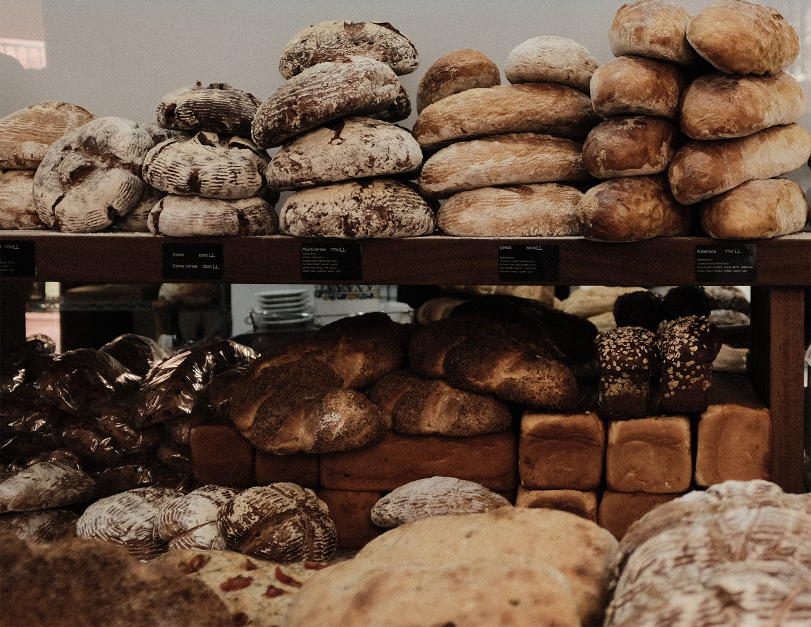
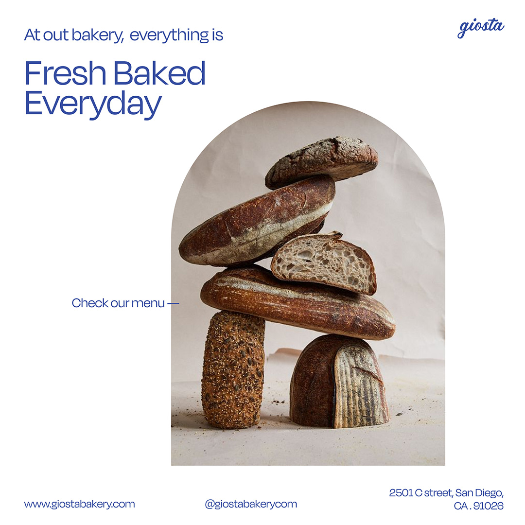
Giosta is a local micro bakery focused on traditional baking techniques and using local sources. The purpose is to create a community connection through food.
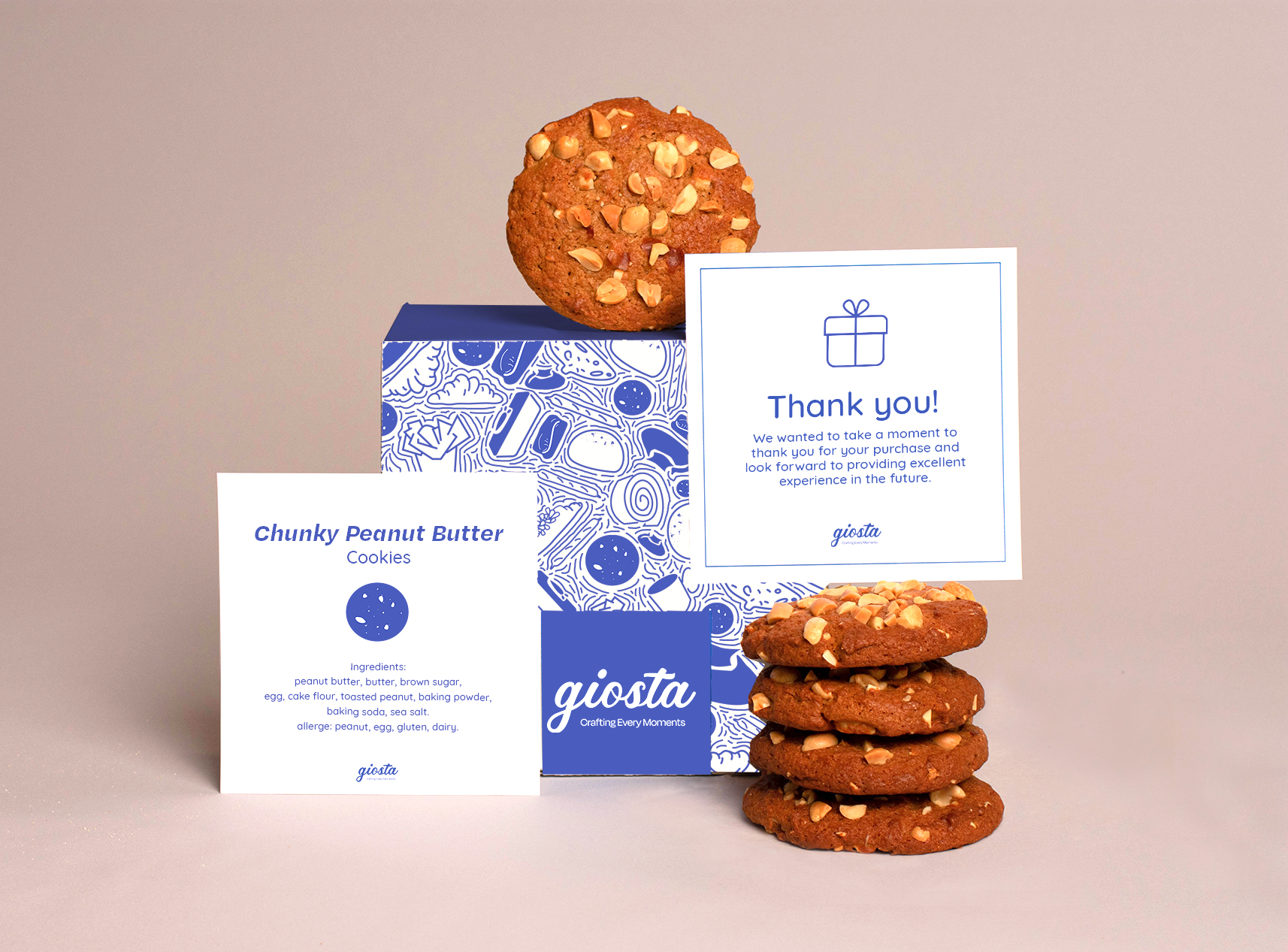
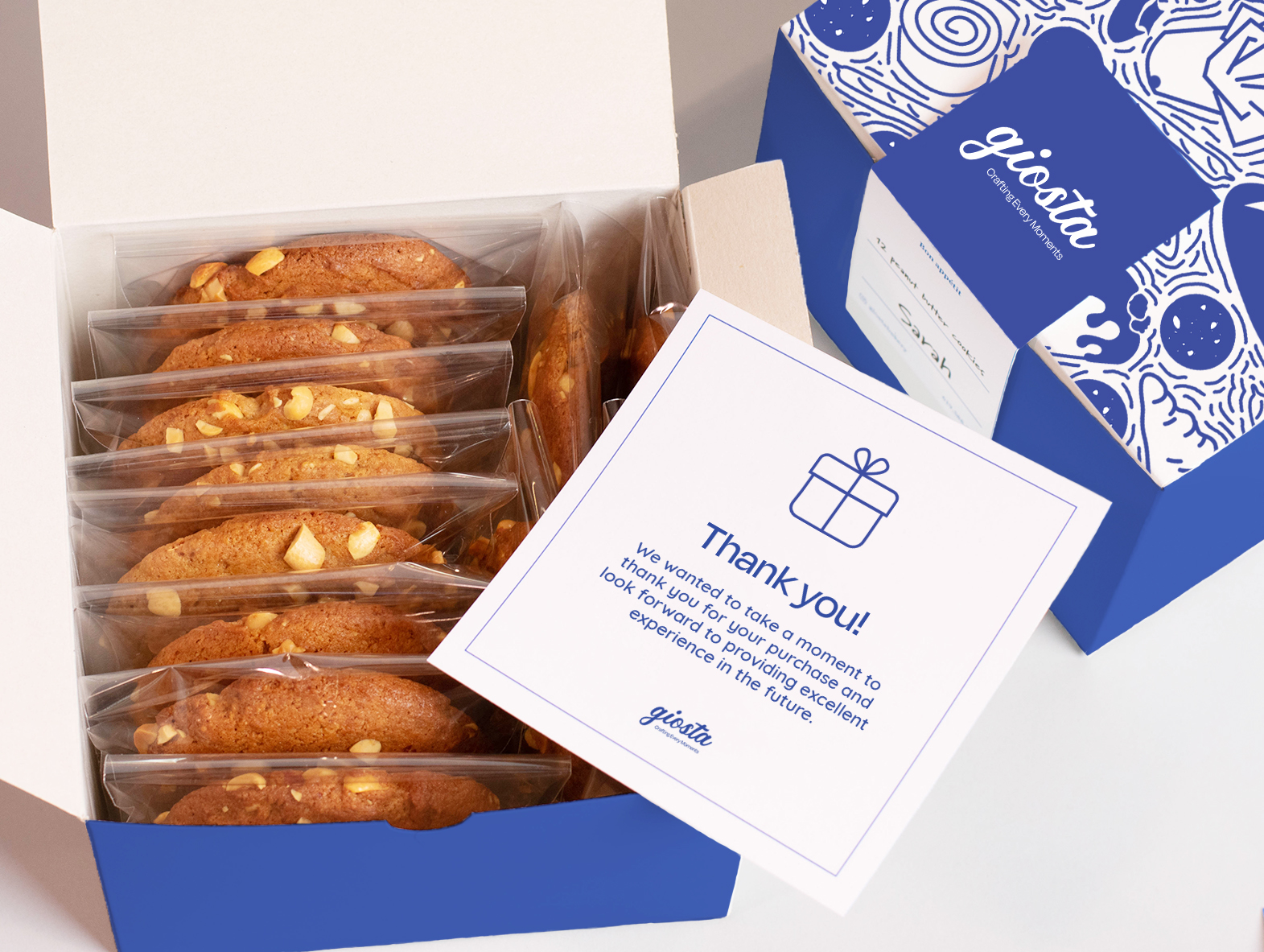
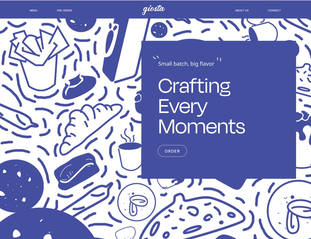
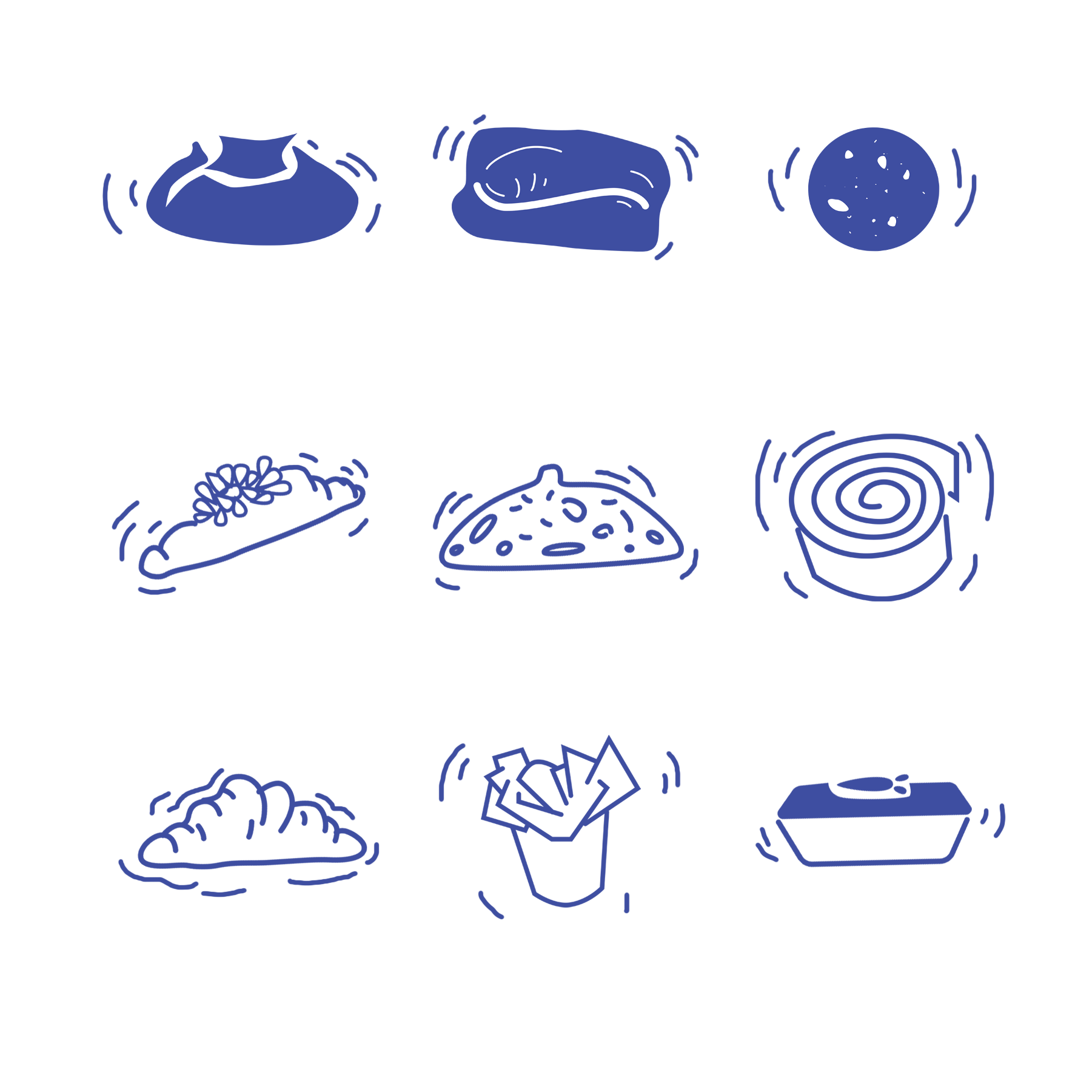
"Giosta" means yeast, inspired by natural leaven used in bread making. The packaging design is influenced by European illustration art and showcases craftmanship.
services
Brand Identity
Illustration
typefaces
FreightBig PRo
Neue Motreal
Museo Sans
Personality
Optimistic
Transformative
completed
Fall 2020


Logo Style
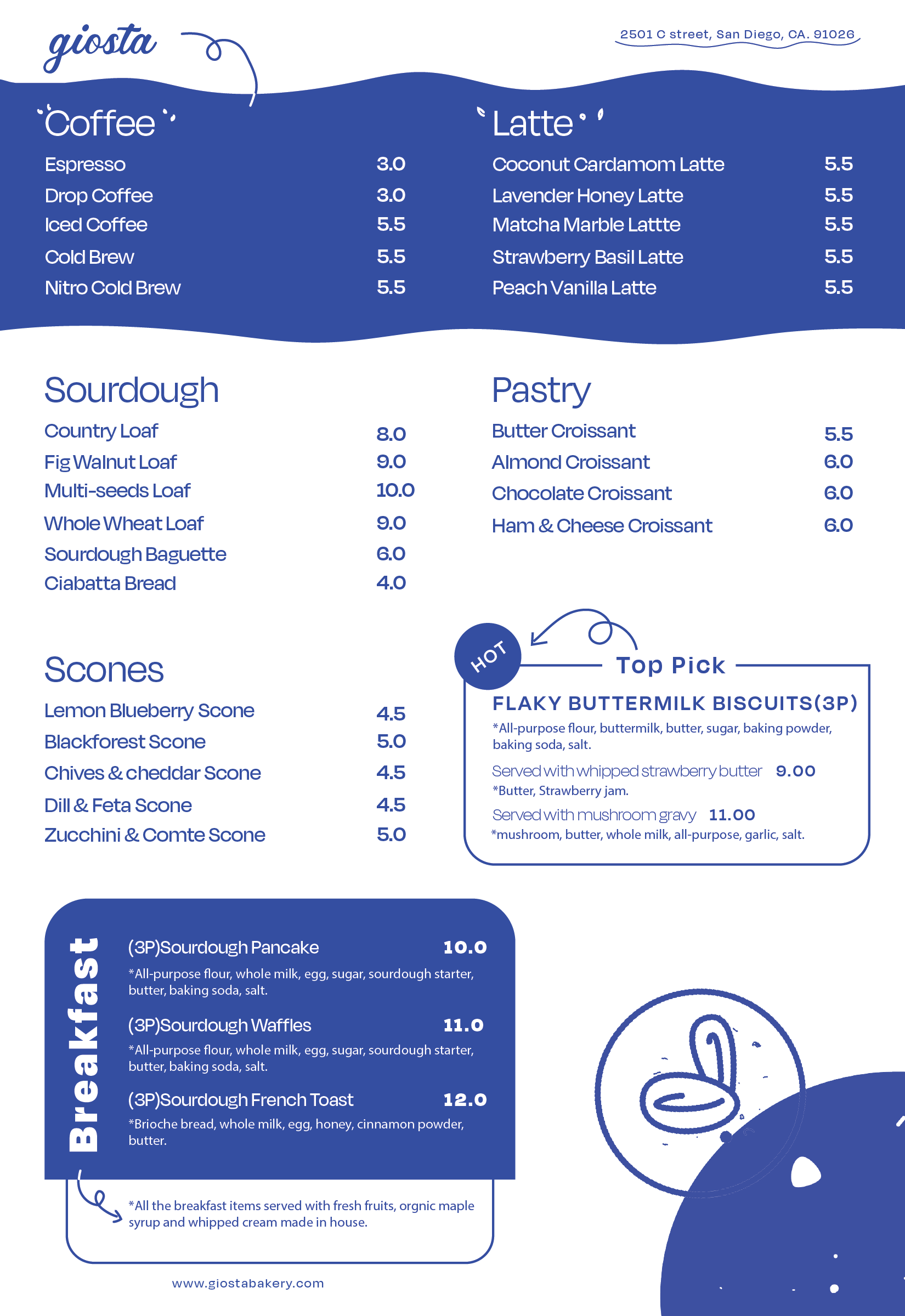
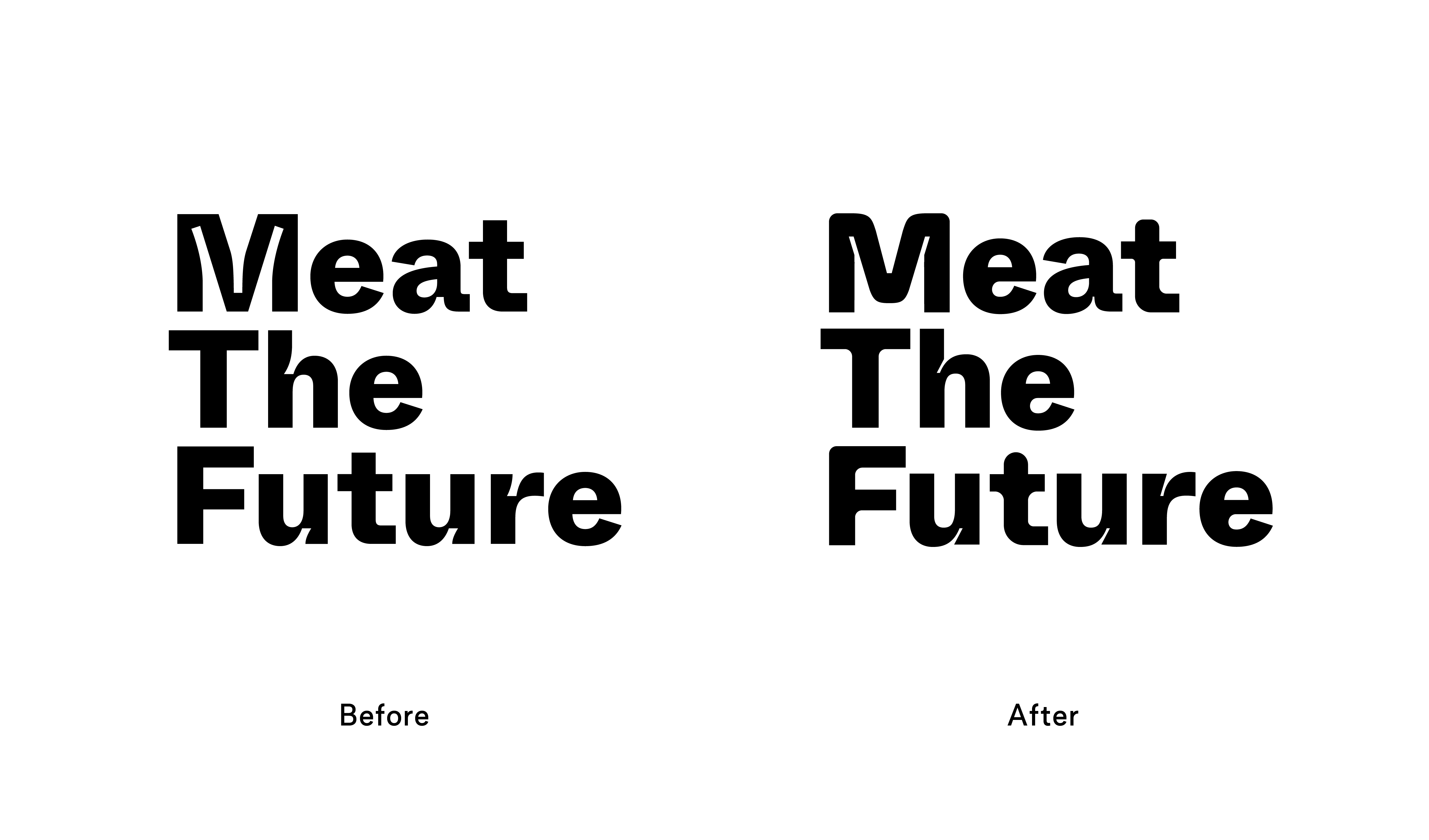
The handwritten font gives a sense of warmth and artisanal feeling. The letters are delicately crafted, with slight variations in stroke thickness and organic shapes, giving it a handmade and personal touch. The overall appearance is elegant and inviting, capturing the essence of a small-scale bakery.