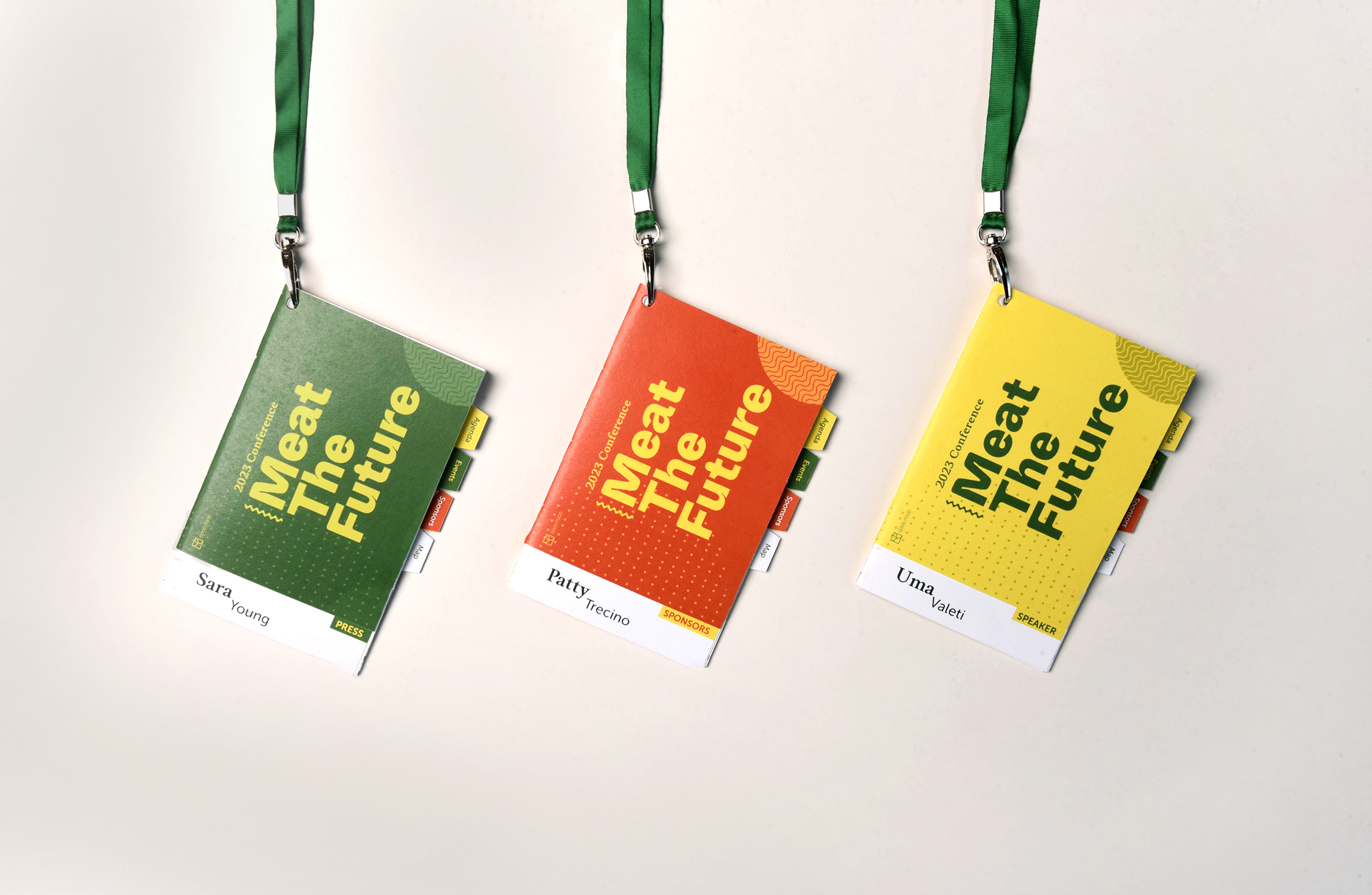
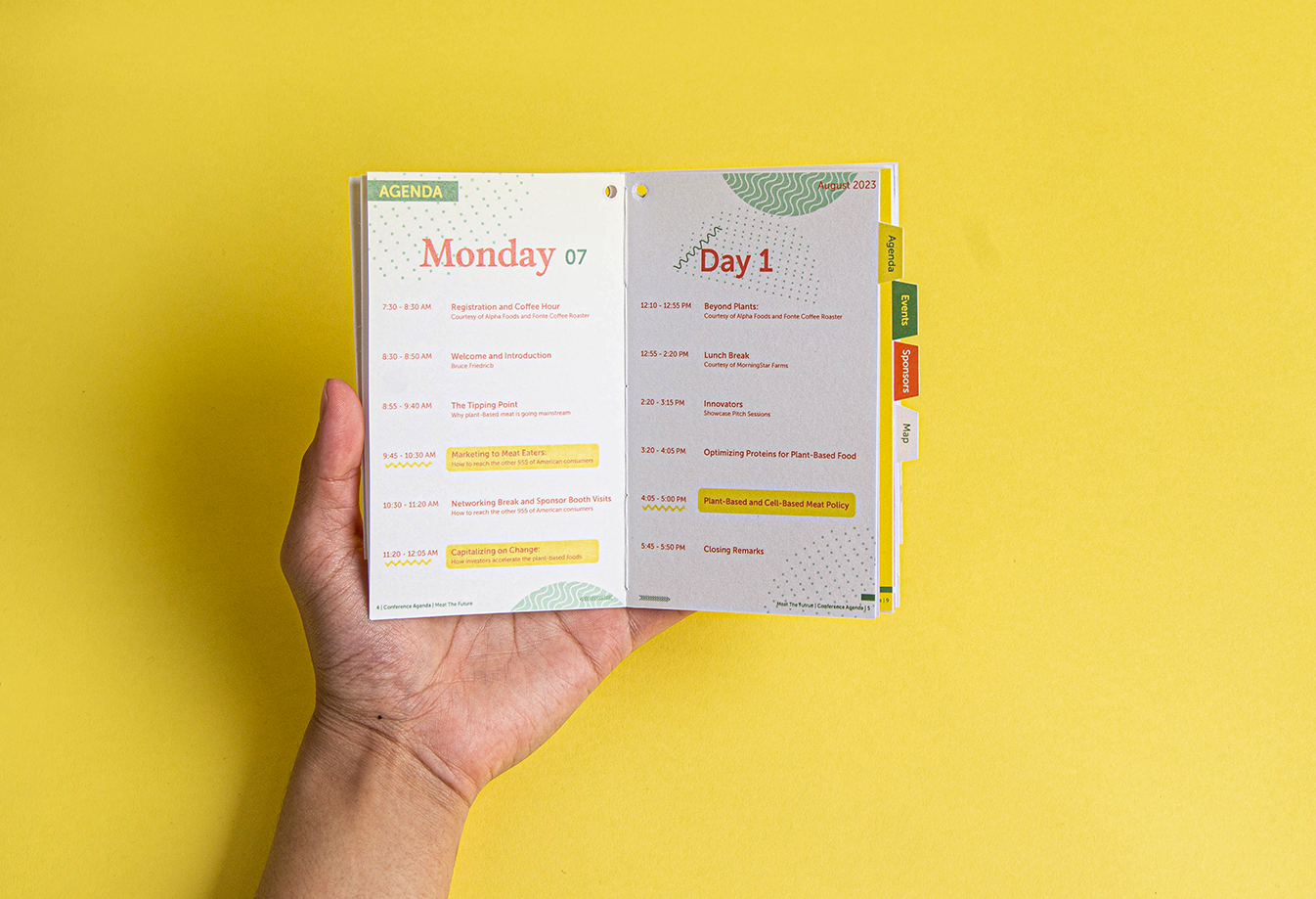
This conference is to bring together individuals, businesses, organizations and experts from the field to share knowledge, and collaborate on ways to promote and improve plant-based food industry.
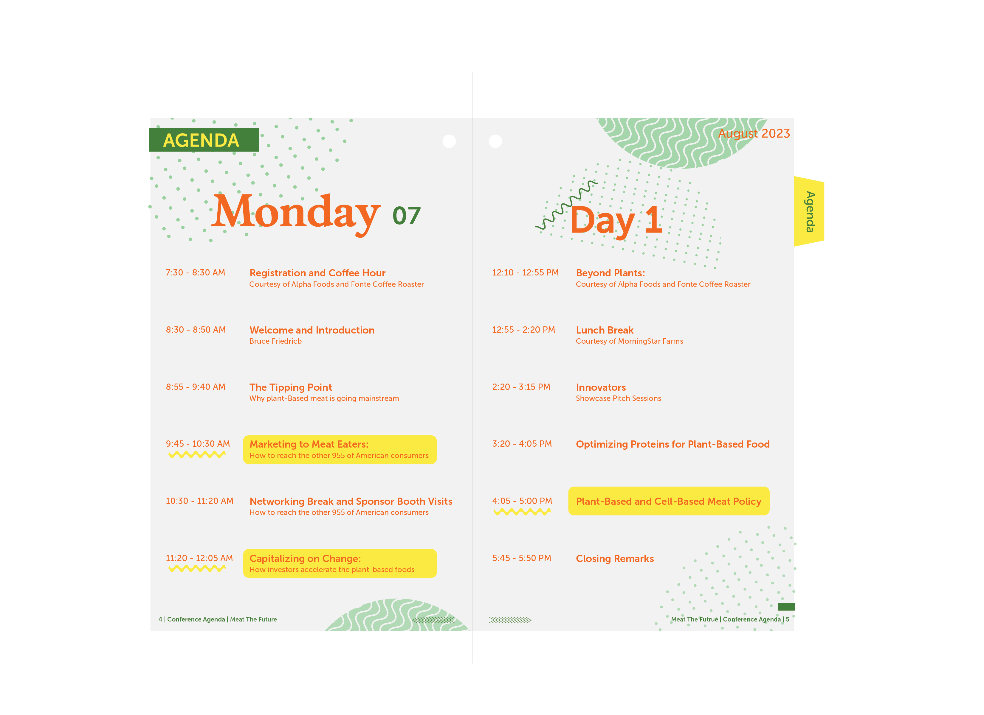
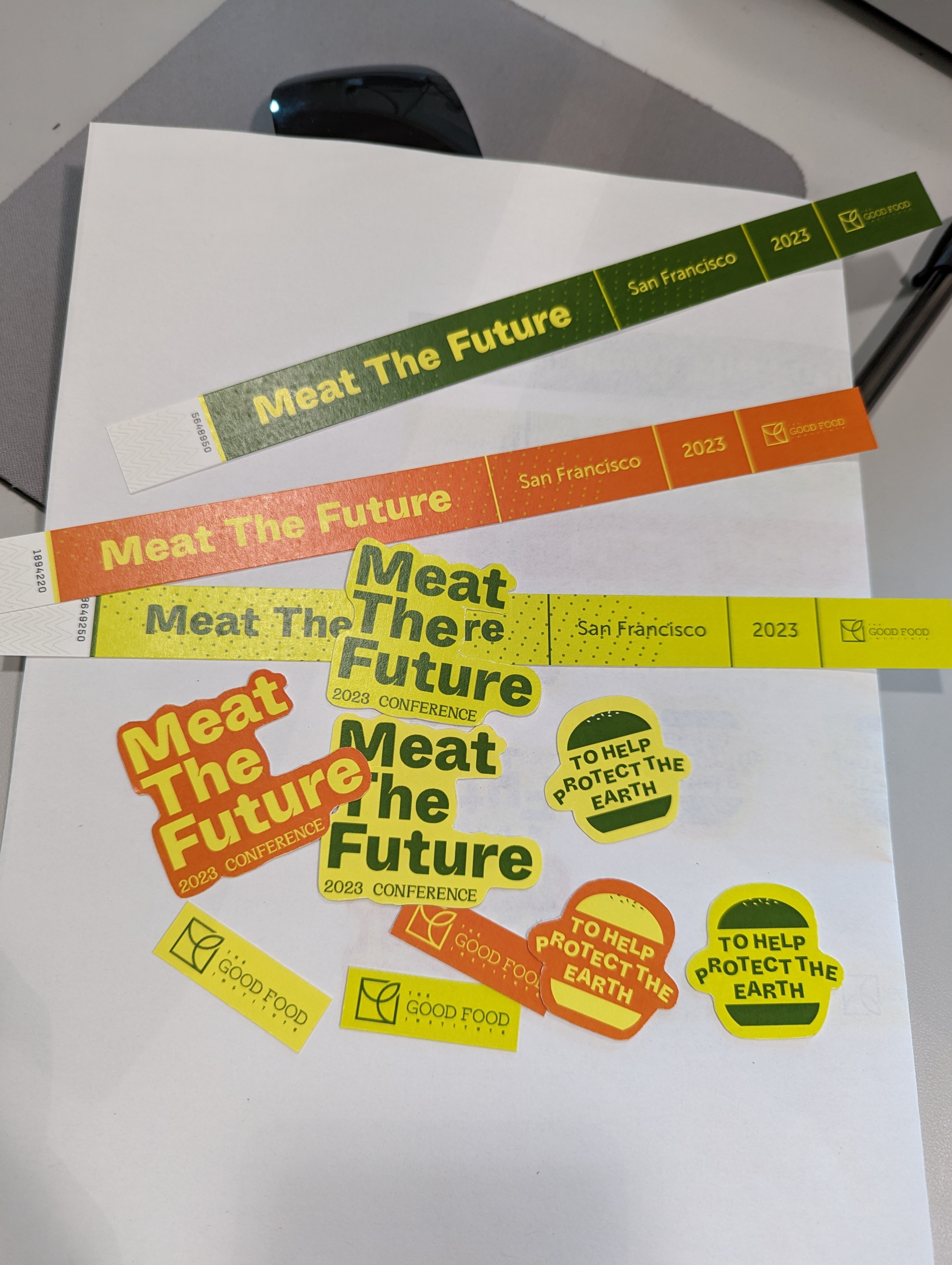
The vibrant and eye-catching bright green, yellow and orange are represents environmental awareness, optimism and creativity.
Brand Identity
Website Design
Whyte Inktrap
MuseeBold
Museo Sans
Optimistic
Transformative
Fall 2021
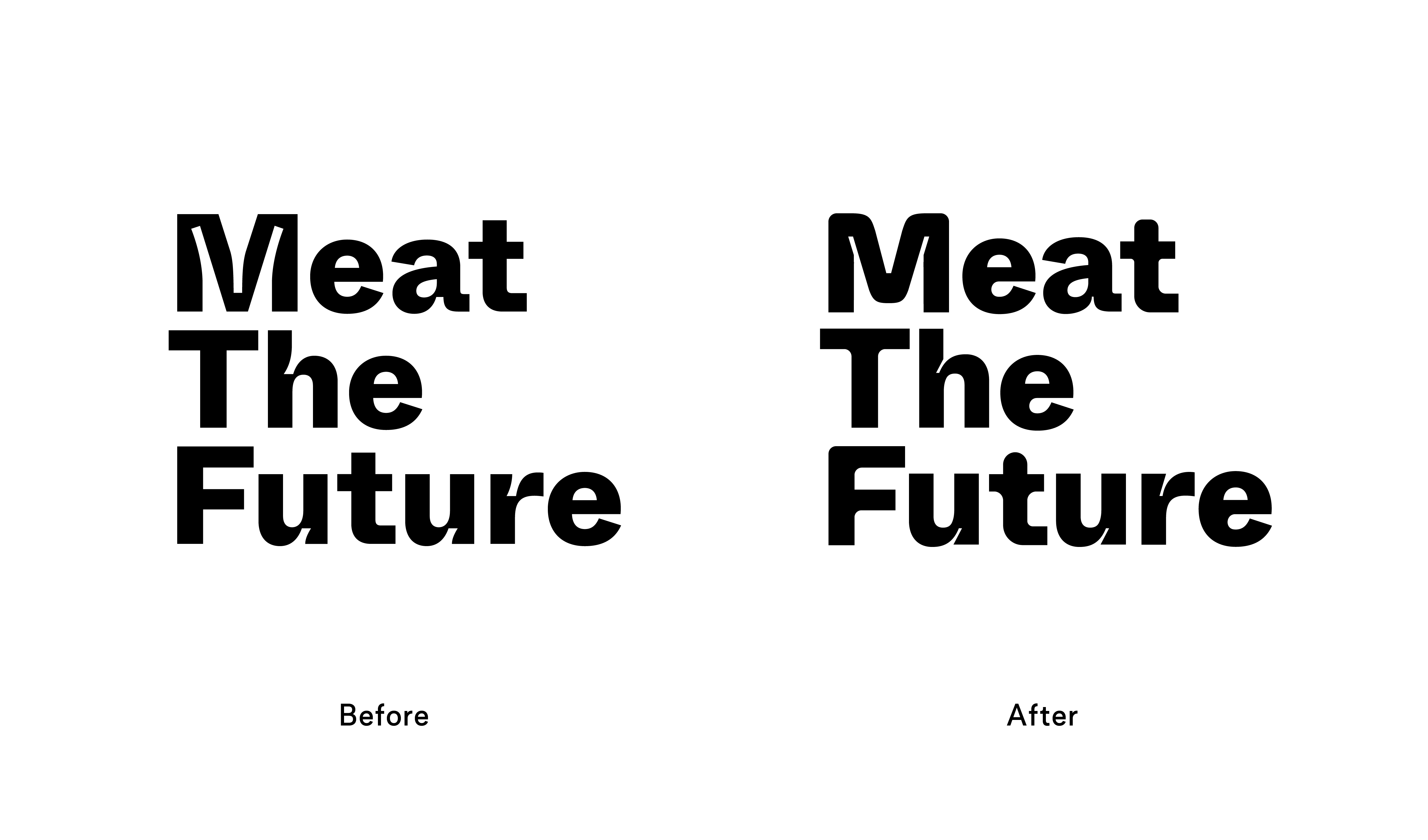
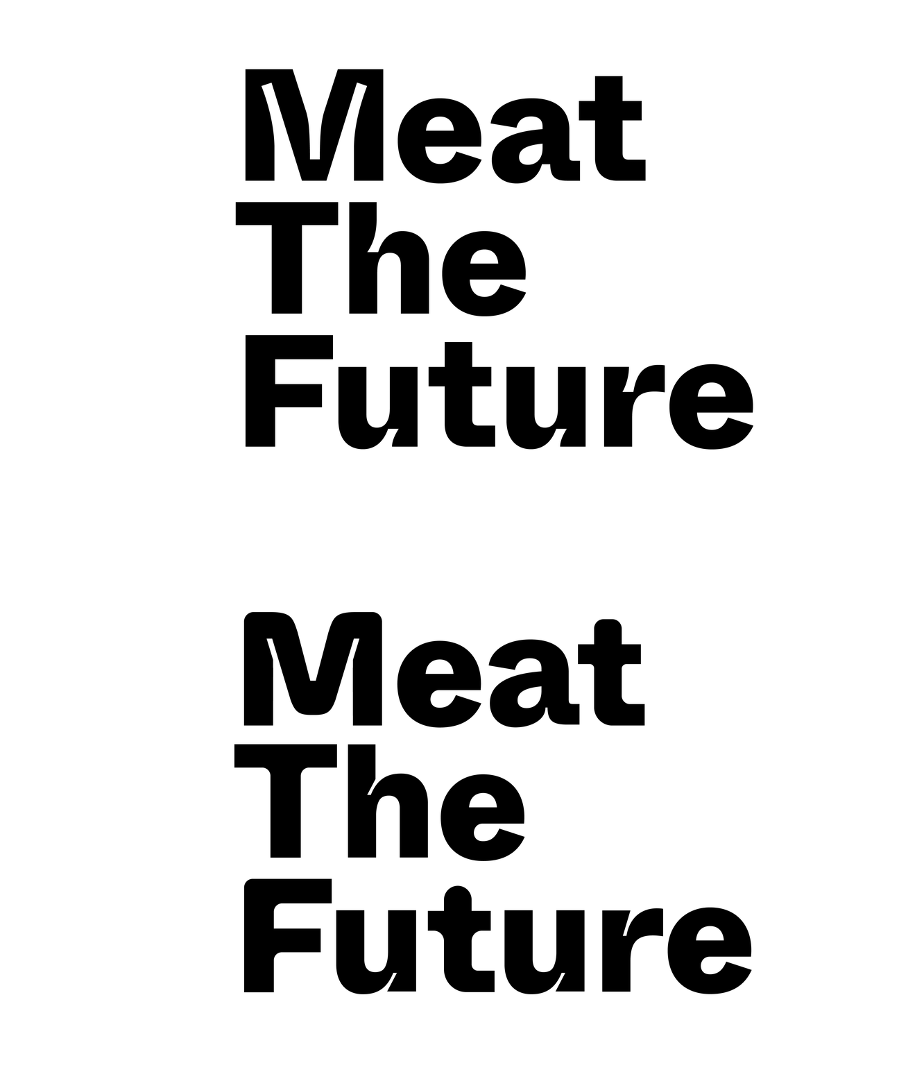
The font Whyte Inktrap used for the logo, it combines classic design elements with modern details.
The round edges giving the logo contemporary feel and convey the purpose of the conferenc.

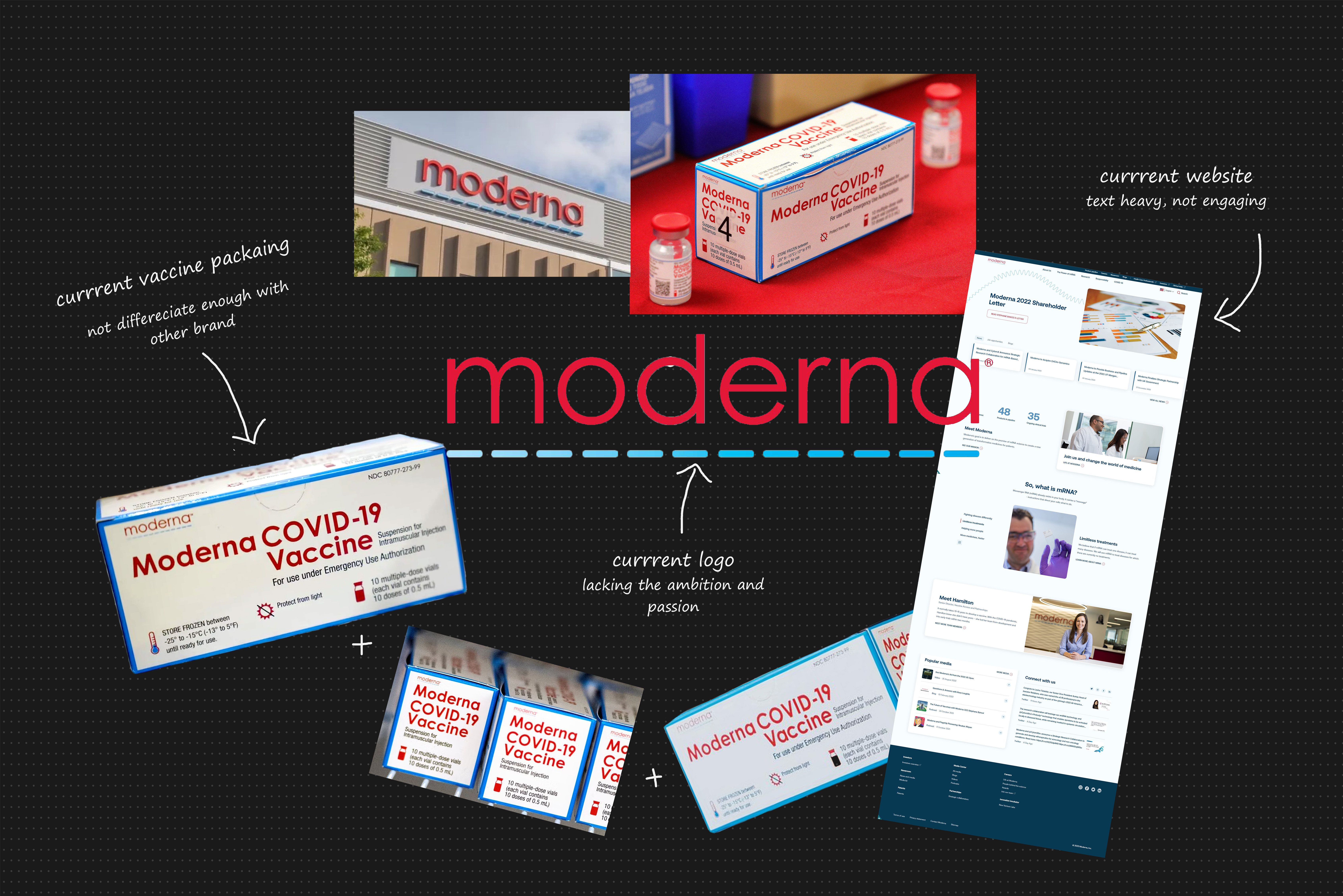
The new website evaluated the brand voice. It is important to show what the company stand for and the values of the mission.