Yooha
Fuel your kids with delicious shake
Packaging | Illustration | Digital | Social

overview
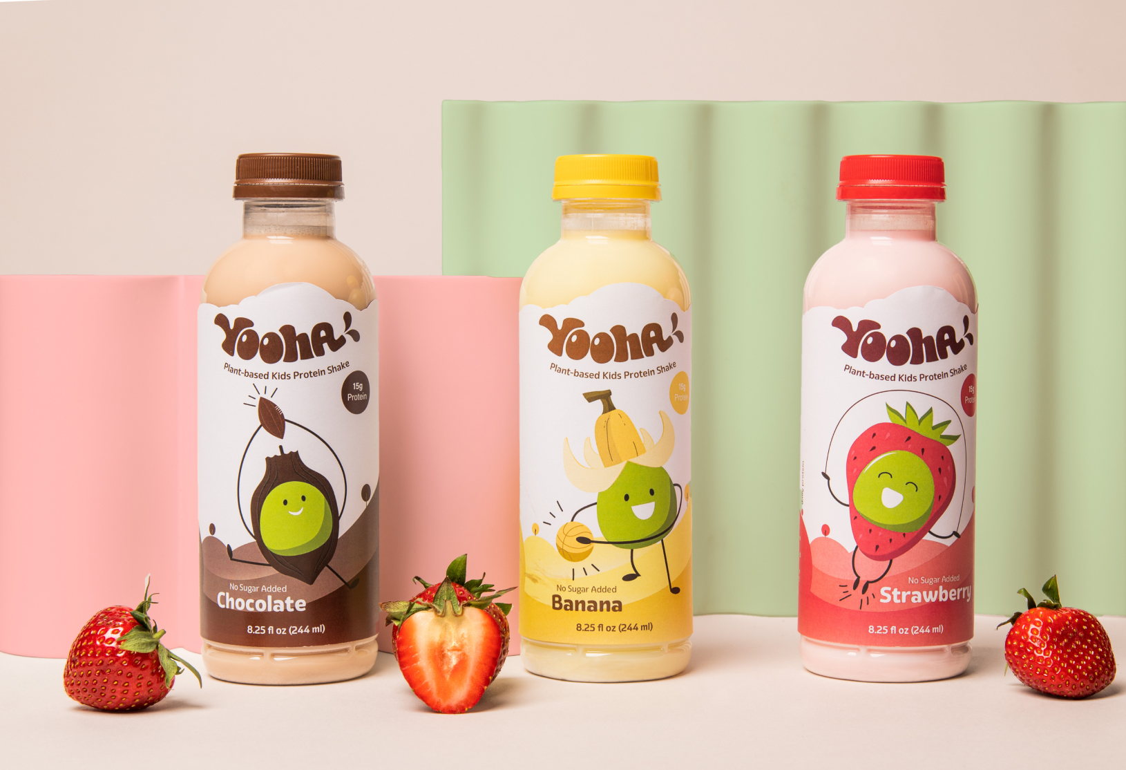
Yooha is a plant-based pea protein shake beverage for kids. It is a nutritional supplement that provides additional protein from children's regular diet.
The vibrant color and fruit-inspired characters expressed happiness and athletic energy. The friendly font choice and illustrations are distinguishable enough from the brands in the market.
services
Brand Identity
Packaging Design
typefaces
Eigerdal
Acumin Variable Concept
Personality
Playfull
Friendly
completed
Fall 2021

estimate the market position
The majority of kids' protein beverage brands are information overload and pharmaceutical-looking. Based on it, the awareness of the direction of the Yooha has grown.

Character is cute
Fonts are soft and approachable
Fonts are soft and approachable

Text heavy
Some information is hard to read
Some information is hard to read

Color is not effectively
Fonts are soft and approachable
Fonts are soft and approachable
Logo development
In order to bring spirit of childhood, the pea pod combined with the brand name, created a playful fusion.
Charactors development
The pea element symbolizes the organic, plant-based foundation of the products, paired with vibrant fruits and fun activities. They are invoking a sense of playfulness and well-being.


Strawberry

Banana

Chocalate
Final label

Logo modification
The font Whyte Inktrap used for the logo, it combines classic design elements with modern details.
The round edges giving the logo contemporary feel and convey the purpose of the conferenc.